
13 PS Plus games whose art direction completely took over my brain this year
Game intel
Bloodborne
Bloodborne: Complete Edition Bundle includes Bloodborne full game plus The Old Hunters DLC expansion. Hunt your nightmares as you search for answers in the an…
Why I’m obsessed with PS Plus as an art gallery
I’ve hit that point with PS Plus Extra and Premium where I sometimes boot up a game less to “beat” it and more to just be in it. Not for the meta, not for the grind – just to soak in the art direction. Sony’s library right now is quietly stacked with games that feel like curated pieces in a digital museum, from brutal gothic nightmares to soft watercolor dreams.
This list isn’t about raw “graphics” or resolution wars. It’s about style, composition, color, and the little visual decisions that make you pause a run just to rotate the camera and breathe it in. I’ve kept it to games you can play through PS Plus Extra/Premium on PS4 and PS5 at the time of writing, so you can literally go download any of these as soon as you’re done reading.
Some picks are obvious (yes, Bloodborne is here, of course), others are smaller indie works that live or die on mood and palette. I’ve tried to cover a wide spread of aesthetics – gothic, cel-shaded, watercolor, minimalism, surreal neon – and explain not just what they look like, but how they feel to play through as visual experiences.
Let’s turn your PS5 into an art gallery.
1. Bloodborne
Every time I reinstall Bloodborne from the PS Plus catalog, I go through the same ritual: walk slowly out of Iosefka’s Clinic, pan the camera up, and just drink in Yharnam’s skyline. Technically it’s “just” a PS4 game locked at 30fps, but art direction beats raw fidelity here so hard it’s almost funny. The crooked spires, the impossible arches, the way the city seems to lean over you like it’s judging you – it’s oppressive in the best possible way.
What kills me is how cohesive it all is. Early on it’s pure Victorian gothic: gas lamps, iron fences, wet cobblestones reflecting that sickly moonlight. Then, as the story peels back, the Lovecraftian layer creeps in – eyes, tentacles, warped geometry – without ever breaking the visual logic of the world. FromSoftware builds a believable city and then corrupts it in front of you. Even basic enemies feel like moving pieces of environmental storytelling.
There’s a bittersweet edge to playing it on PS Plus right now. Recent reports about FromSoftware blocking a proposed Bluepoint remake have reignited the “where’s my PS5/PC version?” frustration. But once you’re actually in Yharnam again, that noise fades. No resolutions or remasters can fake this level of mood. If you only boot up one game on this list just to wander around, make it this one.
2. Ghost of Tsushima
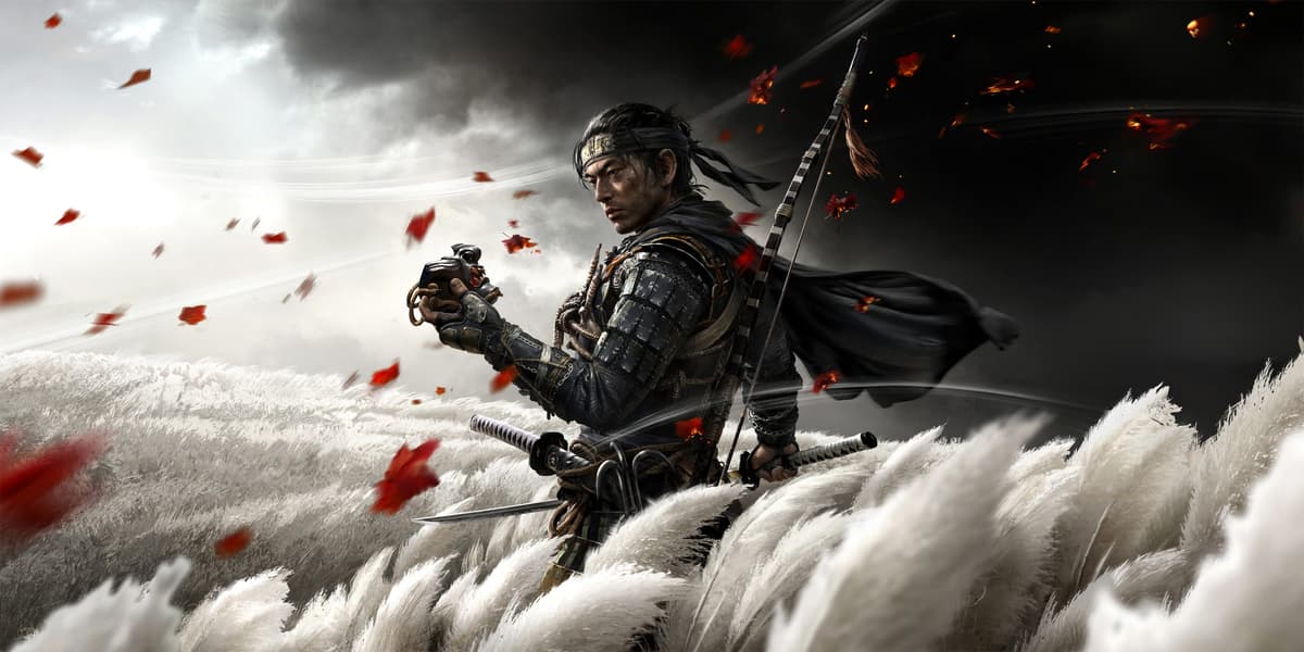
Ghost of Tsushima is the game that finally made me abuse a photo mode more than I played the actual missions. Sucker Punch basically said, “What if every frame looked like a Kurosawa storyboard?” and then just… did that. Even before you hit the dedicated “Kurosawa mode”, the visual language is all about strong silhouettes, wind, and color contrast.
Riding through a golden forest with leaves whipping around you, only for the sky to crack open into a deep crimson sunset, still feels unreal on PS5. The way the game uses color to guide your eye – golden leaves to a shrine, red leaves to danger, purple to mystery – is subtle enough that you don’t notice it until you replay. The “wind as a waypoint” trick might be the cleverest piece of diegetic UI this generation.
What I love is how the art direction respects stillness. You can stand in a bamboo grove doing nothing and the world performs for you: petals drifting, cloth swaying, clouds rolling. As an Extra/Premium subscriber, this is one of those games that justifies the whole service on vibes alone. Set it to Japanese audio, turn off most of the HUD, and let the island flex.
3. God of War (2018) & God of War Ragnarök

If the original Greek trilogy was all angry heavy metal album covers, the Norse era of God of War feels like wandering through an illustrated saga. Both 2018’s reboot and Ragnarök are on PS Plus, and together they’re basically a tour through a mythological art book that someone accidentally made playable.
The thing that sticks with me isn’t just the big vistas – though the Lake of Nine, frozen and unfrozen, is burned into my brain – it’s the craft in the smaller spaces. The etched runes on doors, the way light bounces off dwarven metalwork, the sickly green that always seems to accompany anything Hel-related. When you first reach Alfheim and that blinding, hostile alabaster light floods in, it feels wrong in exactly the way it should. You’re not welcome here, and the color palette tells you so before the enemies do.
Ragnarök doubles down on variety: the warm, autumnal woods of Vanaheim, the suffocating ember haze of Muspelheim, the sterile chill of Niflheim. What really sells it is how Kratos and Atreus are always visually grounded in these spaces – capes catching the wind, frost riming the Leviathan Axe, blood and snow mixing underfoot. As a pair, they’re a masterclass in making myth feel tactile.
4. Gravity Rush & Gravity Rush 2
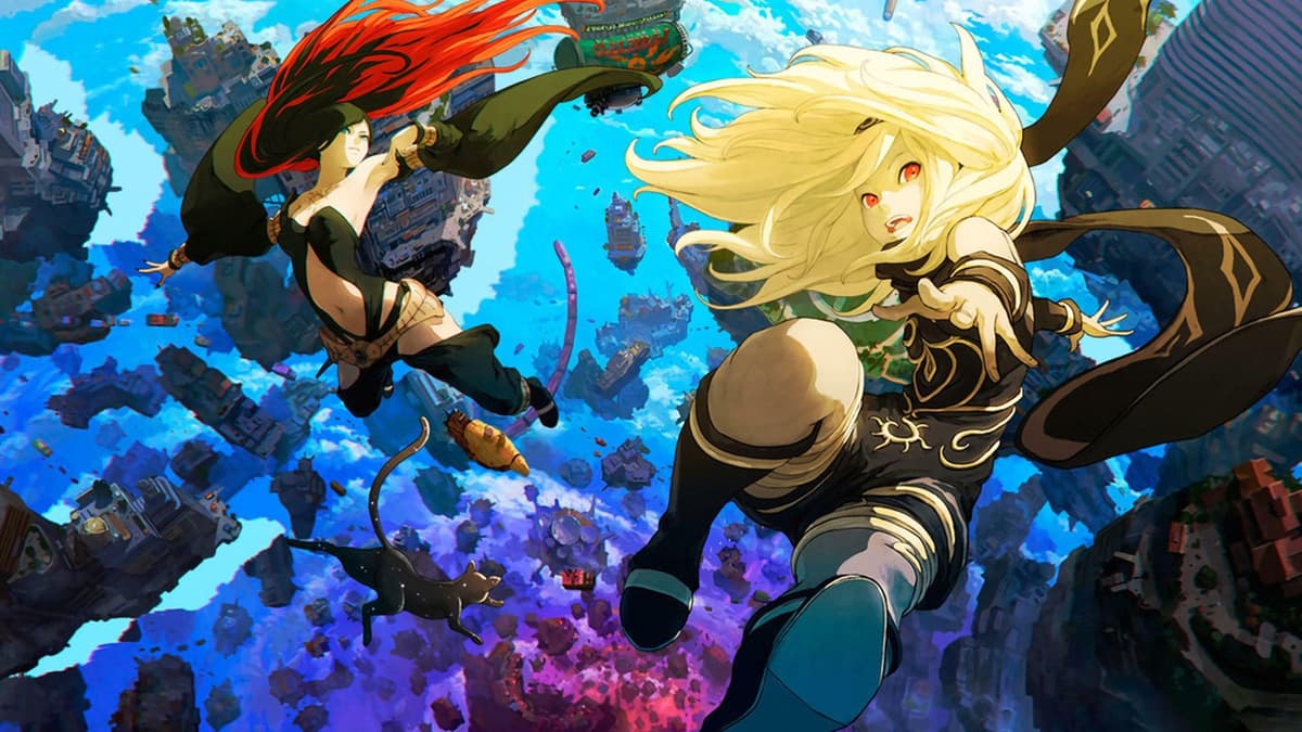
Gravity Rush has always felt like that underappreciated art-house anime you show your friends to score “taste” points. Playing the remastered first game and its sequel via PS Plus, you can see how committed Japan Studio was to a specific aesthetic: somewhere between Moebius, Ghibli, and early-2000s French comics, but still its own thing.
Hekseville is a floating city that shouldn’t work on paper – chunks of architecture dangling in void, gravity wells tearing everything apart – yet the cel-shaded linework and muted, almost watercolor-like color palette sell it as a real place. The moment you first flip the gravity and watch the skyline rotate around you is still one of my favorite “oh” moments in games. It’s not just a mechanic; it’s a visual stunt.
Gravity Rush 2 goes bigger and brighter: more saturated colors, denser cities, wilder costume designs. But it keeps that dreamy, slightly sketchy quality that makes every screenshot look like concept art. Kat’s animations – hair defying gravity, scarf trailing wrong-way-up – are basically the character design equivalent of a signature. If you love art that feels like it’s constantly in motion, these two are must-play comfort food on PS Plus.
5. GRIS

GRIS is the one game on this list that I honestly hesitate to “analyze” too much, because it works best if you just let it wash over you. Nomada Studio built it like an interactive watercolor painting that gradually remembers what color is. When you start, the world is almost monochrome – fragile lines and washed-out blues – and each story beat blooms a new shade into the palette.
What really floored me the first time, playing it curled up with headphones on a late-night PS4 session, was how controlled every brushstroke feels. The architecture is loose and dreamlike, but composition-wise everything is deliberate: tiny figures dwarfed by impossible towers, fragile bridges cutting across blank space, flocks of birds that explode into ink when you touch them. Even failure is gorgeous – falling doesn’t feel like punishment, it feels like another angle on the same painting.
As an Extra/Premium pick, it’s also one of the easiest recommendations: short, no combat stress, and visually meditative. If your brain’s been chewed up by ranked matches or roguelikes, spend an evening with GRIS. It’s art therapy disguised as a platformer, and every frame could live on your wall.
6. Child of Light
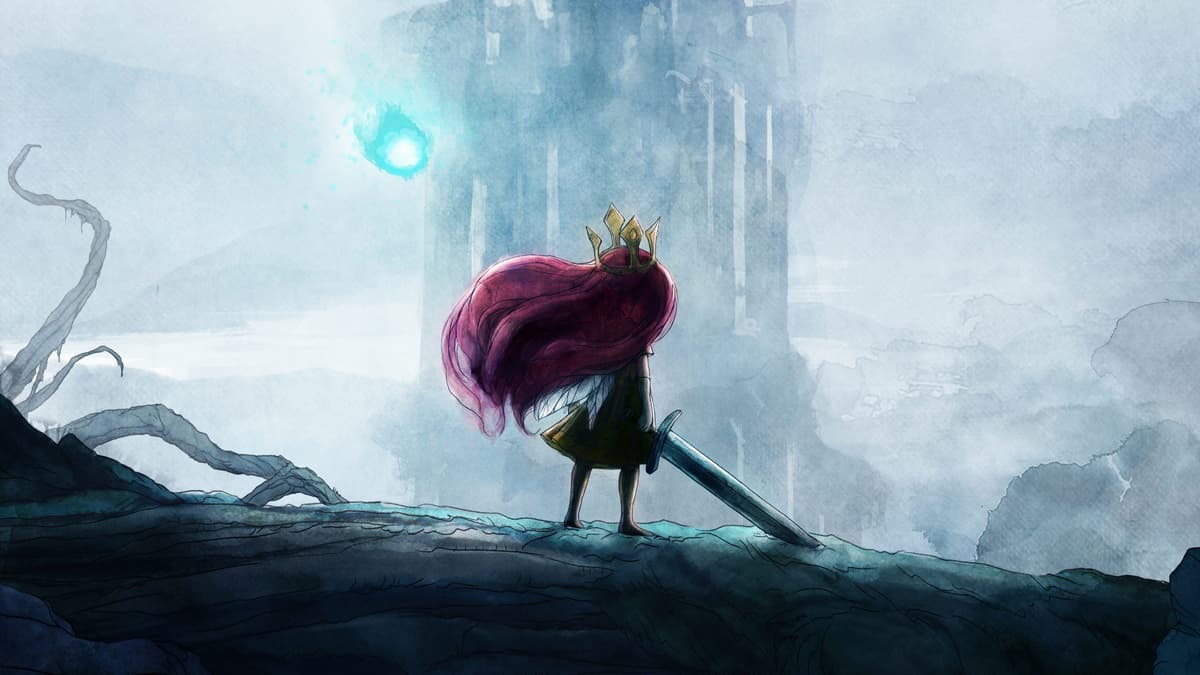
There was a weird, wonderful stretch where Ubisoft briefly pretended to be a boutique art game studio, and Child of Light is the gem from that era that I still think about. Booting it up via PS Plus now, it’s striking how well the watercolor look has aged compared to most “realistic” games from the same time.
The entire world of Lemuria looks like a storybook margin that someone let bleed out onto the page. Backgrounds are soft washes of blues, greens, and violets, with just enough linework to suggest detail without killing the dreaminess. Your main character, Aurora, feels like she’s cut out and laid gently on top of that background, especially when her hair and dress billow as you float. It’s theatrical in the best way, like a moving illustration.
What I always loved is how light itself is part of the art direction. Your firefly companion is literally a moving brush of illumination, revealing hidden paths and adding glows and flares to compositions as you reposition him. Combat arenas don’t break the aesthetic either – they’re framed like vignettes, with enemies painted in the same soft but menacing style. If you grew up on fairy tales and want something that looks like one remembered through a dream, this is the PS Plus pull.
7. Call of the Sea

Call of the Sea is one of those games I initially downloaded “just to see how it looks” and then accidentally finished in almost one sitting. Made by Spanish studio Out of the Blue, it takes that 1930s pulp adventure vibe and paints it with lush, almost poster-like colors. The result is an island that feels both idyllic and slightly off, which is exactly what the story needs.
The thing that sticks with me is how the ocean and the architecture curve. Rocks, waves, even staircases have this subtle rounded stylization that makes everything feel like it was sculpted by hand. It leans into art deco shapes and motifs without ever turning into parody: geometric murals, bold sunbursts, clean lines cutting through wild jungle.
As the plot tilts into weirder, Lovecraft-adjacent territory, the color palette follows – richer teals, more aggressive purples, bioluminescent accents that pop against otherwise muted scenes. It never goes full horror visually, but it constantly hints at something ancient under the paint. If you want a slower-paced, puzzle-driven PS Plus experience where you mostly just wander around looking at gorgeous island vistas, this is a great weekend pick.
FinalBoss // Gear
Level up your setup
01Top-rated gaming headsetson Amazon→02High-refresh gaming monitorson Amazon→03Gaming chairson Amazon→04Discounted game keyson Kinguin→Affiliate links · As an Amazon Associate, FinalBoss earns from qualifying purchases.
8. Dishonored & Dishonored 2
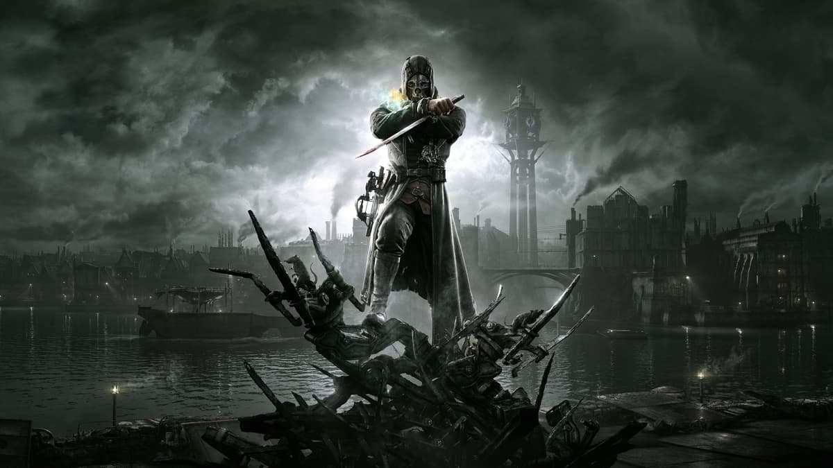
Arkane’s Dishonored games are proof that you don’t need photorealism to build a world that feels grubbily, uncomfortably real. I still remember the first time I zoomed in with the spyglass and realized NPC faces were slightly caricatured – big noses, sharp cheekbones, exaggerated jaws – and how that choice made Dunwall and Karnaca feel like political cartoons you’d walk through rather than generic fantasy cities.
The steampunk-whale-oil-industrial aesthetic is famously strong, but it’s the micro-details that really sell it: rust patterns on metal railings, the oily shimmer of the sea, the way light filters through filthy windows in aristocrat mansions. Color is weaponized too – the sickly greens and yellows of plague-ridden districts versus the opulent reds and golds of the rich. Dishonored 2 pushes even further, giving each mission its own visual thesis: the clockwork mansion’s shifting metal nightmare, the dust-choked reds of Karnaca’s storms, the surreal, shattered perspective of the Stilton manor sequence.
Playing them now via PS Plus, they don’t feel dated; they feel intentional. The slightly painted textures and bold edges age like good illustration rather than like tech demos. If you’re into art direction that’s as political as it is pretty – cities designed to make you resent their ruling class on sight – these two are essential.
Want to Level Up Your Gaming?
Get access to exclusive strategies, hidden tips, and pro-level insights that we don't share publicly.
Ultimate Top Strategy Guide + Weekly Pro Tips
9. Resident Evil Village

Capcom doesn’t get enough credit for its art direction because everyone gets hung up on how technically impressive the RE Engine is. But Resident Evil Village, now sitting comfortably in PS Plus Extra, is a perfect example of how you can be both a tech flex and an art flex.
The opening village is classic gothic Eastern Europe dialed up: crooked wooden houses, snow that looks heavy enough to soak your boots, smoke drifting out of chimneys like the buildings are sighing. Then you hit Castle Dimitrescu and it’s pure decadent horror – blood-red carpets, gold everywhere, those absurdly tall ceilings framed like stage sets. Every wing of the castle has its own visual identity, from wine cellars glistening with something you hope is just wine to sunlit balconies that almost convince you everything’s fine.
What elevates it for me are the shifts in tone as you visit each lord’s domain. Beneviento’s house is all muted browns and washed-out light, leaning into folk-horror dollhouse vibes, while Moreau’s territory is this disgusting, swampy palette that makes your skin crawl. It’s cohesive without ever feeling samey. Play this one with the lights off and HDR on; it’s basically a guided tour through different flavors of gothic.
10. Shadow of the Colossus (Remake)
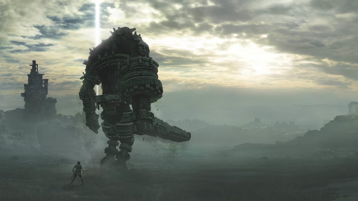
Booting up the Shadow of the Colossus remake on PS Plus still hits me with that weird mix of joy and sadness – joy because Bluepoint’s work is stunning, sadness because the studio’s gone and those recent reports about their scrapped Bloodborne remake sting a bit more now. But as a piece of art direction, this is one of the purest experiences you can have on the service.
The genius of Shadow is how much it does with “empty” space. Wide plains, desolate ruins, quiet lakes – all rendered with a soft, almost hazy light that makes everything feel like a half-remembered legend. When you’re riding across those fields and a colossus rises in the distance, the scale reading is perfect; the creature feels like a moving piece of the landscape rather than a boss dropped into it.
Bluepoint’s remake keeps the sparse composition but sharpens the detail: moss clinging to stone, particles of dust in the air, subtle cloth physics on Wander’s outfit. Importantly, they didn’t over-stylize; it still feels lonely and a little ugly in that deliberate way Team Ico nailed. If you want to understand how negative space and scale can be tools of art direction, this is your case study.
11. Blue Prince

Blue Prince is one of those smaller PS Plus additions that quietly sits in the catalog until you stumble on it, and then you wonder why more people aren’t talking about it. Visually, it’s all about restraint: a minimalistic, almost architectural approach dominated by blues, greys, and clean lines.
The game’s spaces feel like a series of meticulously staged photographs. Rooms are sparse but purposeful – a chair here, a painting there, a shaft of light cutting across a hallway. That focus on composition over clutter gives everything a gallery vibe, like you’re wandering through a modern art museum after hours. When warmer colors do appear, they hit harder precisely because you’ve been living in cool tones for so long.
What I enjoy most is how the art direction feeds into the narrative tone. The blues aren’t just an aesthetic choice; they echo the game’s mood: detached, contemplative, slightly haunted. It’s the kind of game where you pause not because something huge just happened, but because the angle of a staircase plus the way light hits a wall makes you want to stare at it for a minute. If you’re into stripped-back, design-forward visuals rather than bombast, this is a quiet stunner in the PS Plus lineup.
12. Skate Story

I did not expect one of the most striking-looking games on PS Plus to be “you are a glass skater in a neon void,” but here we are. Skate Story takes the familiar language of skate videos – long shadows, glowing city lights, motion blur – and rewires it into something closer to an abstract music video.
Your character is literally made of glass, so every fall shatters you into glittering fragments that catch whatever light the level is throwing around. Environments are a mix of surreal highways, floating platforms, and impossible architecture, all drenched in blues, purples, and sharp neon accents. The ground might reflect like polished obsidian in one area, then blur into painterly streaks in another, but it always feels cohesive because the color story is so strong.
What I love is how the visuals mirror the headspace of learning to skate: equal parts freedom and fragility. Speed makes the world smear into abstract color, while bailing snaps you back into crisp, painful clarity. It’s stylish, sure, but it’s not empty style – the art direction is doing emotional heavy lifting. If you’re tired of “gritty realism” and want something that looks like a dream you’d have after an all-night skate session and too much synthwave, queue this up.
13. Sword of the Sea

If you’ve played Journey or Abzû, you know Giant Squid operates in a very specific lane: meditative games that feel like moving murals. Sword of the Sea, available through PS Plus, might be their cleanest expression of that style yet. It’s basically “surfing through a desert dream” as an art direction pitch, and the team absolutely commits.
The sand isn’t just a texture; it behaves like water, forming waves you carve through on your hoverboard-sword. Golden dunes fold and ripple around you, catching light in ways that make screenshots look like oil paintings mid-brushstroke. Scattered through that sea of sand are towering ruins, whale-like creatures, and oases of cool turquoise that break the warm palette at just the right moments.
Color and motion are the stars here. Long downhill runs turn the world into layered bands of orange, red, and blue, while distant structures shimmer in the heat haze like mirages. There’s very little clutter in the UI or composition, so your eye is always on the horizon, chasing some new silhouette. As a PS Plus pick, it’s perfect for those evenings when you don’t want stress, you just want to glide through something beautiful and let the art direction do the talking.
14. Venba

Venba is probably the smallest, most domestic game on this list, and that’s exactly why its art direction hits so hard. It’s a short narrative cooking game about an Indian family in Canada, and it uses color and composition the way a great cinematographer uses close-ups.
The kitchen – your main stage – is painted in warm, homely tones: soft yellows, gentle browns, rich reds from spices and sauces. Food isn’t just rendered; it’s framed. Steam curls off pots in stylized, almost comic-like lines, ingredients pop against clean backgrounds, and plating a dish feels like finishing a panel in a graphic novel. When the game wants you to feel comfort, everything glows. When it wants you to feel tension or distance, that warmth recedes, replaced by cooler, flatter lighting.
What I love is how Venba visually ties culture, memory, and food together. Flashbacks use slightly different palettes and framing, almost like you’re looking at faded photos. Subtle background details – magnets on the fridge, the way clutter builds up or disappears – say as much about the family’s journey as the dialogue does. It’s a brilliant reminder that “artistic” doesn’t have to mean grand vistas; sometimes it’s just the way a kitchen table is drawn.
Wrapping up: turning PS Plus into your own art tour
The thing that excites me about PS Plus Extra/Premium right now is how easy it is to treat it like a rotating gallery. One night you’re trudging through decaying gothic streets in Bloodborne, the next you’re floating through watercolors in GRIS or surfing sand in Sword of the Sea. Same hardware, completely different visual worlds.
Availability will shift over time – services always do – but as of now, every game on this list is a download away if you’re subscribed. Whether you want moody realism, bold cel-shading, or intimate domestic illustration, there’s something here worth installing purely to wander around and stare at things. Sometimes that’s all you need from a game night.
So next time you’re scrolling the PS Plus catalog feeling choice paralysis, don’t overthink it. Pick one of these, turn off as much HUD as the game will let you, and give yourself permission to play tourist in someone else’s vision for a few hours.