
Euro Truck Simulator 2 ditched its old Route Advisor — here’s why that matters
Game intel
Euro Truck Simulator 2
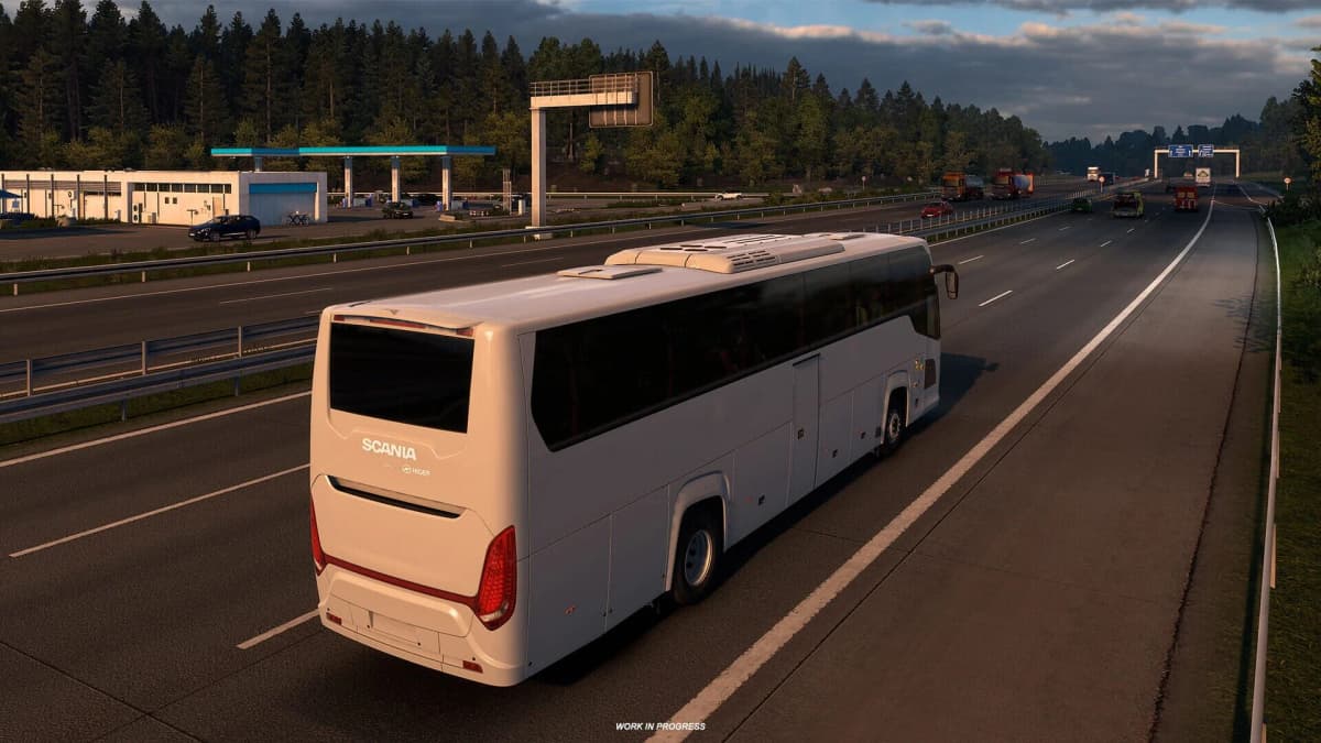
Trade cargo for passengers in a whole new ETS2 journey! Take a seat behind the wheel – not of a truck, but of a coach. The Coaches DLC brings a new dimension t…
Why SCS reworked Euro Truck Simulator 2’s Route Advisor – and why it matters
This caught my attention because the Route Advisor has been one of ETS2’s most familiar interfaces for over a decade. Changing something so ingrained is risky, but SCS is doing it to solve a real problem: the original single-panel HUD could no longer scale cleanly as trucks, systems, and player setups got more complex.
- New widget-based Route Advisor exposes speed, gear, RPM, timers, and system indicators as independent HUD elements.
- Critical feedback (damage thresholds, active systems) is clearer; notifications are consolidated and less spammy.
- Deeper details (job info, damage percentages, vehicle adjustments) moved into a Quick Info menu to reduce driving distraction.
- The update arrives as SCS continues big map projects like the UK rework and an Iceland DLC preview, showing the studio is modernizing both UI and world content.
Breaking down the widget-based Route Advisor
SCS replaced the old compact Route Advisor with a modular, widget-driven HUD. Each widget has a single purpose – speed, selected gear, fuel, engine RPM, exact rest timers, delivery timers, and system indicators – and can be toggled independently for cabin view, exterior view, both, or turned off entirely. The familiar F3 global UI toggle still hides HUD elements while keeping essential notifications live.
Two practical shifts stand out. First, system feedback is now explicit: icons appear only when systems (cruise control, engine brake, lane assist, lights, parking brake, wipers, differential lock, etc.) are active, so drivers see at a glance what’s engaged. Second, damage feedback stops being an abstract percentage and becomes actionable: the UI highlights when damage will start affecting truck behavior, and shows new damage events more clearly.
Notifications were consolidated into a single, colour-coded area (alerts, warnings, announcements) with only one message shown at a time, which reduces visual clutter during critical driving moments. Automatic parking prompts were also slimmed down into a small widget, making the feature useful without nagging players who prefer manual control.
Why this update is happening now
SCS frames the change as a response to evolving complexity: more truck systems, finer driving assists, wider variety of screen sizes and control methods (keyboard, wheel, gamepad), and community feedback that the original panel couldn’t expand without becoming cluttered. Moving deeper, less urgent info to the Quick Info menu (job details, service options, damage percentages) separates “what you need while driving” from “what you should check when stopped.” That’s a sensible design principle for a simulation that now serves both relaxed road-trippers and hardcore sim racers.

FinalBoss // Gear
Level up your setup
01Top-rated gaming headsetson Amazon→02High-refresh gaming monitorson Amazon→03Gaming chairson Amazon→04Discounted game keyson Kinguin→Affiliate links · As an Amazon Associate, FinalBoss earns from qualifying purchases.
How this fits SCS’s broader roadmap
This UI overhaul doesn’t happen in isolation. Around the same time SCS introduced the Route Advisor redesign, the studio published Steam News updates outlining large map projects: the UK Rework team introductions (with designers handling London, Stonehenge, ports, and more) and an Iceland DLC preview featuring dramatic coastlines and coastal hazards. Those posts show SCS juggling visual, map-scale work alongside systems and UX improvements — a sign the studio is investing in both new places to drive and better ways to drive there.
Put another way: SCS is modernizing the player experience on two fronts. Map teams rebuild and expand the world you explore; the UI team ensures that the increased complexity of trucks and environments doesn’t drown players in information.
Want to Level Up Your Gaming?
Get access to exclusive strategies, hidden tips, and pro-level insights that we don't share publicly.
Ultimate Gaming Strategy Guide + Weekly Pro Tips
What players should expect
Expect an initial period of adjustment. The modular Route Advisor is more configurable and less intrusive for experienced players, while offering clearer feedback for newcomers. The Quick Info menu keeps the HUD tidy but requires a habit change for those used to seeing everything at once. SCS says this is a foundation — more widgets and refinements are possible — so the system will evolve with community input.
TL;DR
SCS’s switch from a single Route Advisor panel to independent widgets is a practical fix for a decade-old UI that couldn’t scale. It gives clearer system feedback, reduces clutter, and pairs logically with the studio’s ongoing map work (UK rework, Iceland DLC previews). It won’t feel perfect immediately, but it’s a direction that makes ETS2 easier to play across different setups and playstyles — and it leaves room for future polish.