Marathon’s neon 90s fever dream hooked me… but Bungie’s art theft still ruins the vibe
The moment Marathon’s art style finally clicked for me
The exact moment I realised Marathon had its hooks in me wasn’t a clutch gunfight or a big loot extract. It was when I stopped dead in the middle of a swamp, stared at a ludicrous pink cube jutting out of the mud, and thought: “Okay, what the hell is this game’s deal?”
I’ve been playing Bungie shooters since LAN parties with the original Halo, so of course I was curious when they announced a Marathon reboot as an extraction shooter. But I’ll be honest: the first trailers just looked like someone had dumped a bag of neon toys into a mud puddle. Plastic textures, glossy suits, flat colours smeared over realistic terrain… it felt like concept art that accidentally shipped as a game.
Then I actually played it. After a few hours of getting farmed by squads who clearly didn’t touch grass during the beta, the art direction stopped being noise and started making sense. The more I learned the maps, the more that “neon toybox dropped onto a real planet” look turned into something cohesive, deliberate… and honestly, kind of brilliant.
And that’s the maddening part: Marathon’s art direction is the thing that elevates it above the sea of grimy extraction shooters — yet that same art direction is also stained by Bungie’s plagiarism mess with independent artist Fern Hook (a.k.a. Antireal). I love how this game looks, but I can’t pretend the way some of that look was created doesn’t bother me.
“Realism graphic” isn’t just marketing waffle
Bungie’s been throwing around this term “realism graphic” to describe Marathon’s art style, and at first I rolled my eyes. It sounded like the kind of nonsense phrase you invent in a pitch deck when “stylised” doesn’t sound cool enough.
But the longer I played, the more that phrase started to feel annoyingly accurate. Marathon’s maps all run on this two-layer system:
- Layer 1: The natural world — realistic rock formations, swamps, wetlands, eroded cliff faces, murky water, all rendered with this grounded, almost documentary-style sensibility.
- Layer 2: The human intrusion — violently geometric structures, flat matte colours, harsh contrasts, giant logos slapped on every possible surface.
The “realism” is the terrain of Tau Ceti IV. The “graphic” is the industrial human (and corporate) footprint on top of it. These two layers should clash like oil and water, and visually they do… until the lighting steps in and glues everything together.
This is the part that quietly impressed me. If you go back and look at early alpha footage, Marathon’s bright blocks and ramps feel like dev tools left in the level by mistake. In the launch build, the way light hits those same shapes — the bounce, the reflections, the way fog and atmospheric haze soften the edges — finally sells the idea that these garish constructions actually occupy the same physical space as the swamps and rockbeds.
Standing in a dank marsh, with realistic mud sucking at your boots while a lime-green corporate scaffold cuts across the skyline, you get this strong sense that humanity didn’t arrive to coexist. We landed, stamped our brand guidelines all over the environment, and bolted everything together like it came out of a 3D printer catalogue.
That theme even runs through your character. You’re not a rugged PMC survivor — you’re basically a synthetic shell woven by bio-engineered silk worms before each run. You’re disposable hardware. The world looks like you: assembled, replaceable, bright, functional. All of it feels like product design that metastasised into a planet.
Vectorheart, The Designers Republic, and Marathon’s 90s DNA
None of this came out of nowhere. Marathon’s art director, Joseph Cross, has been very open about where the game pulls from, and if you grew up with 90s graphic design like I did, you can spot the lineage instantly.
Marathon is basically a love letter to vectorheart — that hyper-graphic, high-contrast design movement that bubbled up in the mid-90s alongside Y2K aesthetics. Think simple geometric shapes, aggressive diagonals, bold type, huge logos, and colour palettes that look like a highlighter pen exploded.

The clearest ancestor here is The Designers Republic, the legendary British studio that helped define the look of games like WipEout and early PlayStation branding. Their whole thing was turning consumer culture and corporate identity into this ironic, ultra-stylised playground of warnings, barcodes, and pseudo-brands. Marathon absolutely drinks from that well.
Logos and iconography are everywhere in this game. Faction intros look like motion graphics reels. Every megacorporation feels like it’s spent more on its brand book than on worker safety. And it’s not just Western design either; the game leans heavily on Japanese retro-futurism.
If you’ve watched Akira or Ghost in the Shell, you’ll recognise that cold, efficient, slightly oppressive futurism in how Marathon treats its cities and tech. One of the corps is literally called Sekiguchi Genetics. Slap a kanji on a clean white wall with a red stripe and your brain immediately screams “future corp.” It’s manipulative, but it works, and Bungie knows exactly what it’s doing.
Then you have more modern touches: QR codes hidden around corners, glitch overlays, HTML snippets and ASCII woven into menus and marketing. The main cinematic has the fingerprints of Alberto Mielgo all over it — the same painterly, heightened reality vibe he brought to Jibaro and The Witness in Love, Death & Robots.
If you boiled Marathon’s influences down to a checklist, it might look uncomfortably derivative. But standing inside those maps, with the soundscape thrumming and the lighting doing its thing, it all coheres into what one Japanese review nailed as a “palpitating amalgam” of visuals and systems. That’s exactly how it feels: over-stimulating, yes, but unified in a way most live-service shooters never even try for.
FinalBoss // Gear
Level up your setup
01Top-rated gaming headsetson Amazon→02High-refresh gaming monitorson Amazon→03Gaming chairson Amazon→04Discounted game keyson Kinguin→Affiliate links · As an Amazon Associate, FinalBoss earns from qualifying purchases.
When style actually makes you play better
The thing that really sold me, though, is that Marathon’s art direction isn’t just eye candy. It’s a blunt instrument for game design.
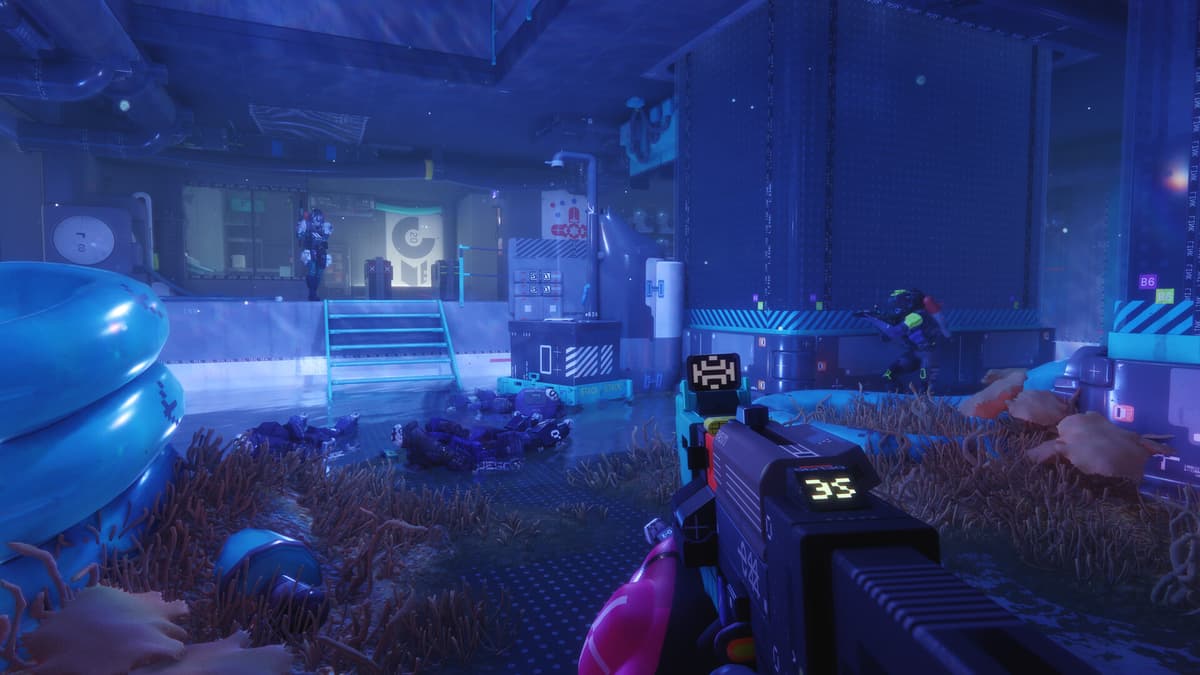
Extraction shooters live or die on information. Where is loot? Where is danger? Where are exits? Escape from Tarkov leans on dense realism and memorisation to answer those questions. ARC Raiders goes for bombastic sci-fi vistas that sometimes drown you in spectacle. Marathon threads a nastier needle: it teaches you to read its corporate graffiti as survival intel.
- Blood is blue. Not because it looks cool (though it does), but because that vivid blue reads instantly against the greens and browns of the natural terrain. Downed players become beacons. You learn to track third parties by looking for that colour trail.
- Open natural spaces feel lethal by design. Realistic marshes and rocky plateaus feel huge and vulnerable. You’re visually exposed, and you feel it in your gut. Crossing them is a conscious risk.
- Enclosed “graphic” spaces feel safer, but suffocating. Step inside a brightly coloured, logo-plastered facility and sightlines shrink. Corners become death traps. The colour coding makes navigation easier, but the claustrophobia ramps up.
- Logos and colour codes double as signposts. You don’t just see a symbol and think “nice branding;” you instinctively file it as “high value crate,” “faction objective,” or “exfil route.” After a dozen runs, you navigate more by graphic language than by map memory.
Even the weather gets the treatment. On one map, a lethal “rain” event starts dropping from the sky. Except it’s not rain; it’s cubes. Hard-edged, polygonal blocks slamming into the ground. It’s a ridiculous visual, but it reinforces the story: this world’s natural systems have been corrupted by human experimentation. Even the atmosphere is glitching into corporate geometry.
🎮 Get This Game at the Best Price
Compare prices instantly and save up to 80% on Steam keys with Kinguin — trusted by 15+ million gamers worldwide.
*Affiliate link — supports our independent coverage at no extra cost to you

Now, I’m not going to pretend it’s all perfect. The same obsession with stylisation that makes the world so instantly distinctive sometimes kneecaps usability. Loot readability can be rough. The UI occasionally feels like a futuristic poster first and a practical HUD second. There are places where Bungie absolutely chose vibe over clarity, and in a sweaty PvPvE match, that’s the last thing you want.
But on balance? I’ll take this over the generic Unreal Engine 5 “wet concrete and particle fog” look we’re drowning in. Marathon’s willing to be ugly, confusing, even off-putting at first glance if it means carving out its own visual identity. That’s rare enough in 2026 that I’m willing to forgive some rough edges.
Want to Level Up Your Gaming?
Get access to exclusive strategies, hidden tips, and pro-level insights that we don't share publicly.
Ultimate Gaming Strategy Guide + Weekly Pro Tips
The theft at the heart of Marathon’s aesthetics
And here’s where the whole thing gets complicated.
In 2024, artist Fern Hook, who goes by Antireal, publicly accused Bungie of ripping off her 2017 work in Marathon’s marketing and early materials. People did the side‑by‑side comparisons, and the similarities weren’t subtle. “Evident” is putting it mildly.
To Bungie’s credit, they didn’t hide behind vague PR fluff forever. They eventually admitted that an ex‑employee had used her art as a base without permission, and said the responsibility was “100%” on them. They promised compensation and started scrubbing or replacing the offending assets.
Legally, that’s probably the best outcome you can hope for once the damage is done. But culturally? Ethically? For me as a player who actually cares about this stuff? It sucks. Because the one thing Marathon absolutely did not need was for its best feature — its bold, unapologetic art direction — to be tainted by stolen work.
I’ve seen some people hand‑wave it away: “They paid her, they owned up, it’s fixed, move on.” And sure, if all you care about is whether your frames drop during an extract, maybe that’s enough. But you don’t get to trumpet how daring and innovative your aesthetic is while part of that aesthetic was, at least for a while, riding on someone else’s uncredited labour.
What stings even more is how unnecessary it was. Marathon is packed with legitimate, well‑synthesised influences: vectorheart, 90s anime futurism, Mielgo’s painterly surrealism, retro web culture, even motorsport-style branding. Bungie clearly knows how to remix references into something new. So why did anyone, at any stage, feel the need to “borrow” directly from a working artist’s portfolio?
As someone who plays a ridiculous number of shooters every year, I’m used to calling out design laziness. Copy‑paste guns, identical UI layouts, the same three cyberpunk palettes. Marathon finally felt like a studio swinging for the fences again. Finding out that part of that swing meant stepping on a small creator’s neck? That takes some of the shine off, no matter how good the end result looks.
Why this art direction actually matters for Bungie’s future
This isn’t just about vibes. Marathon isn’t some artsy indie that can live on cult status alone. It’s Bungie’s first new IP in a decade, a massive bet from a studio that’s been bleeding goodwill on Destiny 2, and a pillar in Sony’s big live‑service strategy. For them, this thing isn’t a side project; it’s a life raft.
In a genre where “you drop in, loot, and try to escape” is basically standard boilerplate now, visual identity might be the most important differentiator left. Gunplay can be tuned. Meta can be patched. Progression systems can be rebuilt. But the way a game looks and feels to exist in? That’s what sticks in your brain when you log off.

And that’s where Marathon actually has a shot at long‑term relevance. People aren’t just saying “the shooting feels good,” though it does — tight, snappy, very “Bungie.” They’re saying “this game looks like nothing else I’m playing right now.” The word‑of‑mouth buzz is as much about the art direction as it is about the extraction loop.
If Bungie can keep iterating on that foundation — new maps that push the realism/graphic contrast further, more wild weather events, deeper integration of corporate iconography into gameplay — Marathon’s visual identity could do the heavy lifting while they sort out balance, endgame, and content cadence.
But that only works if players trust where that art is coming from. If every new splash screen makes people wonder “okay, but who actually made this?”, that’s corrosive. It chips away at the legitimacy of what should be one of the strongest, bravest art directions in any big-budget shooter right now.
Where I land: in love with the look, pissed about the stain
After dozens of runs, I can say this without hesitation: Marathon’s art direction is the reason I keep coming back. Not the battle pass. Not the meta. Not even the very solid gunfeel. It’s that moment when you crest a ridge and see a slab of turquoise corporate concrete slicing through a foggy ravine, logos shouting at you in three languages, and you think, “Yeah, this world is completely screwed, and I want to spend more time in it.”
I adore how unapologetically designed it all is. I adore that it embraces colour in a genre that’s obsessed with mud and muzzle flash. I adore that it wears its 90s and 2000s influences on its sleeve instead of chasing the safe, boring version of photorealism everyone else is racing toward with Unreal Engine 5.
But I also can’t pretend the plagiarism scandal is some minor footnote. When I load into a match, that context is there in the back of my mind. Not enough to make me uninstall, but enough to sour the victory lap every time I want to just uncritically praise what Bungie accomplished here.
For me, the line is this: I’m willing to enjoy Marathon, to recommend it, to dissect its “realism graphic” weirdness like the art nerd I am. But I’m not willing to let Bungie’s incredibly slick presentation distract from the fact that they only did the right thing after being called out in public by an artist whose work they’d lifted.
Marathon proves that big-budget shooters can still look daring and specific and strange, that they don’t all have to be “gritty realism” with a battle pass slapped on top. That’s worth celebrating. But if we’re going to celebrate it, we also have to demand that the studios behind this stuff respect the people whose ideas they’re drawing from.
So yeah: I’m the moth, and Marathon is the light. I’m still flying toward it. I just can’t ignore the burn marks on the bulb.