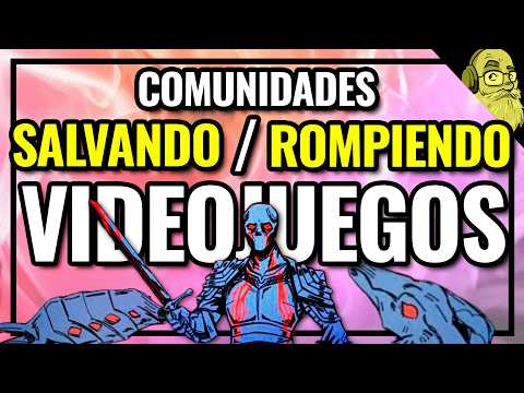
Mortal S didn’t ‘sell out’—it proved player feedback can actually work
The moment Mortal S made me shut up and listen
I remember booting up Mortal S for the first time and thinking, “Okay, this looks sick… and also borderline unplayable.” It’s this medieval first-person roguelite drenched in harsh comic-book lines, thick outlines, red-and-blue insanity everywhere. It looked like somebody spilled ink and neon on a CRT and then dared me to survive in it.
I’d already seen clips floating around on social media – people chaining melee combos, kicking skeletons into traps, dismembering enemies so they kept crawling after them like something out of a VHS horror tape. It was exactly my kind of chaos. I’ve sunk stupid amounts of time into games like Ziggurat, Gunfire Reborn, and the old-school Painkiller stuff; I live for that crunchy first-person action where movement, timing and positioning matter more than a battle pass ever will.
But Mortal S hit different. The game is hard, the enemies do not care about my feelings, the traps are everywhere, and for the first hour my eyes genuinely hurt. I loved the idea of the “unfinished comic” look – like early ink passes that never got cleaned up – but in motion? With mobs swarming me and spikes firing off? It was visual chaos dialled to eleven.
And that’s exactly why what happened next matters so much. Because instead of doubling down and hiding behind the holy shield of “authorial vision,” the solo dev behind Mortal S did something I wish more studios had the guts (and humility) to do: he turned a polarizing art style into an option, not a prison.
The art style that almost lost me
For anyone who hasn’t touched it: Mortal S is a roguelite in the strict, uncompromising sense. Four dungeons in a row, no mercy, no handholding. You start with a single character, push through this narrow hub gate, and then it’s on. Every run you’re juggling passive upgrades, gear drops, and a surprisingly deep combo system that mixes light attacks, dashes, kicks and specials into chained moves.
Once I started learning the combos, the whole game opened up. What looked like mindless hack-and-slash turned into this brutal, tactical dance. Certain chains buff you, others create big crowd-control moves, and once it “clicks” you’re not button-mashing — you’re executing a plan at high speed. And because enemies can be dismembered — arms, legs, even heads — the battlefield is constantly evolving. A headless brute still stumbling toward me because I screwed up the spacing? That’s the kind of detail that lodges in my brain.
The problem was never the mechanics. The problem was seeing what the hell was going on.
The original comic-book art style is bold as hell: stark outlines, super limited colour palette, heavy contrast everywhere. Screenshots look amazing. But in actual play, especially in the darker, busier rooms, it can turn into a blur of red, blue and black lines. I got used to it — eventually — but I know a lot of people who bounced off immediately. Not because the game was bad, but because their eyes said “nope.”
And this is where the usual discourse kicks in. The chorus of “respect the author’s vision” fires up. The idea that if players struggle with the visuals, that’s their problem. “The game isn’t for everyone,” right? I’ve said that sentence myself in arguments, and sometimes it’s true. But Mortal S forced me to interrogate how often that line gets used as a lazy shield to avoid doing better.
“Respect the author’s vision” is often a lazy excuse
I’ve been playing games long enough to remember when “patch” basically meant “expansion pack on a disc.” If a game shipped with bad UI, bad font choices, or an eyestrain-inducing colour scheme, that was it. You either dealt with it or you skipped the game. There was no second draft.
Nowadays? We’re in patch heaven and patch hell at the same time. Some devs use updates to fix and elevate already-good games — others treat launch day as an overglorified beta test and expect players to politely wait six months for the thing we already paid for to become functional.
But somewhere in between “ship broken” and “ship perfect” is a third path: ship something good, then listen and refine. And that’s exactly what happened with Mortal S.
Here’s the context. Mortal S launched into Early Access on Steam back in 2023, got its 1.0 release at the end of August 2025, and quietly built a cult following. Solo dev Nikola Todorovic pushed out constant updates, refined the melee feel, added content, and by the time it hit 1.0 it wasn’t just “promising” — it was already a genuinely strong game with an “Extremely Positive” rating on Steam. We’re talking over 4,000 reviews and around 95% positive, and more than 300,000 copies sold by late 2025. This wasn’t some desperate salvage job.
And yet, there was a recurring complaint among people who liked the game: the art style and UI were punishing to look at. Not “I hate the look,” but “my eyes can’t track what’s happening,” or “I literally can’t read this font.” That’s a crucial difference. Players weren’t asking Nikola to turn Mortal S into a generic fantasy shooter; they were asking to actually see the excellent game he’d already built.
At that moment, he could’ve easily pulled the standard move: post a defensive Steam update about creative integrity, maybe toss in a “sorry if it’s not for you,” and carry on. A lot of devs, big and small, have taken that road. I don’t blame them entirely — it’s exhausting being dogpiled — but it is a choice.
What Nikola actually did — and why it matters
Instead, Nikola chose something harder: he questioned his own assumptions.
In a Steam update, he basically said (paraphrasing here): look, I love the classic art style, but I’ve seen enough conflicting feedback that I have to ask myself if a new way of seeing the game would really hurt anything. Gameplay is what matters most, and if a different “coat of paint” helps more people experience that gameplay, maybe that’s worth the work.
So he didn’t rip out the original look. He didn’t “fix” it. He added a whole new visual option: a “realistic” mode with reworked colours, lighting, and shaders. Suddenly, Mortal S wasn’t just ink-and-neon chaos — it also had a cleaner, more legible option where enemies, traps, and interactables pop more clearly against the environment.
On top of that, he tackled something that almost every indie messes up at least once: typography. The old hand-drawn-ish font fit the grimy comic vibe, sure, but reading long descriptions of items and abilities in the middle of a run felt like deciphering cursed text. In his own notes, Nikola acknowledged that style matters, but comfort has to come first when you’re trying to read critical information.
The update swapped most of the in-game text for a cleaner typeface — still stylized, not some default system font, but vastly easier on the eyes. He even kept the old logo intact, so the identity of Mortal S stayed the same at a glance. The core vibe wasn’t thrown away; it was refined.
Crucially, he framed the whole thing around one idea: keep the chaos alive, but give players control over how they perceive it. He didn’t tone down the difficulty. He didn’t put training wheels on the combat. He didn’t flatten his identity into some bland, safe style. He just removed unnecessary friction between the player and the game’s actual strengths.
This isn’t selling out — it’s understanding what actually matters
I’ve lost count of how many times I’ve seen a dev get accused of “selling out” the instant they tweak an art style, add an accessibility option, or introduce a lower difficulty mode. There’s this weird macho strain in gaming culture where suffering through bad UX or hostile design is considered some kind of purity test.
FinalBoss // Gear
Level up your setup
01Top-rated gaming headsetson Amazon→02High-refresh gaming monitorson Amazon→03Gaming chairson Amazon→04Discounted game keyson Kinguin→Affiliate links · As an Amazon Associate, FinalBoss earns from qualifying purchases.
This isn’t selling out — it’s understanding what actually matters
I’ve lost count of how many times I’ve seen a dev get accused of “selling out” the instant they tweak an art style, add an accessibility option, or introduce a lower difficulty mode. There’s this weird macho strain in gaming culture where suffering through bad UX or hostile design is considered some kind of purity test.
🎮 Get This Game at the Best Price
Compare prices instantly and save up to 80% on Steam keys with Kinguin — trusted by 15+ million gamers worldwide.
*Affiliate link — supports our independent coverage at no extra cost to you
Mortal S is the counterargument that actually matters: if the game’s soul is its combat, its tension, its roguelite structure, then the visuals and UI are delivery systems for that soul. The original look of Mortal S is still there for the people who adore it. The new realistic mode doesn’t overwrite it; it coexists. That’s not compromise, that’s optionality.
I’m someone who actually likes harsh aesthetics. I grew up on janky early 3D horror and washed-out PS2 browns. I’m not asking every game to be sanded down for mass appeal. But when a solo dev looks at his 95% positive roguelite — a game that’s already successful, already making money — and still says, “I can make this more comfortable to read and parse without breaking it,” that deserves respect.
The result? More people can play it. More people can stick with it long enough to get to the good stuff — the depth of the combo system, the way each new class feels like a different game, the sick satisfaction of kicking a stunned enemy into spinning blades. The game didn’t get easier; it got clearer. That’s accessibility at its best.
Want to Level Up Your Gaming?
Get access to exclusive strategies, hidden tips, and pro-level insights that we don't share publicly.
Ultimate Gaming Strategy Guide + Weekly Pro Tips
Patches used for good, not just damage control
Part of why Mortal S stands out to me is timing. This wasn’t a “panic update” to save a sinking ship. The game launched in decent shape, iterated steadily through Early Access, hit 1.0, and then kept improving. When the big visual rework landed, the game already had a thriving community, great word of mouth, and strong sales on Steam.
I’ve watched other games stumble into greatness through patches — Death’s Gambit turned from an okay, buggy gothic Metroidvania into something genuinely special after years of updates; No Man’s Sky basically reinvented itself after its catastrophic launch. Those stories are inspiring, but they’re also born out of crisis. They’re tales of rescue.
Mortal S is something different: it’s a story of refinement. A solo dev looked at a product that was already working and decided “good” wasn’t enough if avoidable barriers were turning interested players away. That’s not just listening to feedback; that’s knowing when feedback is pointing at the edges of your blind spot.
And yes, this is only possible in the modern patch era. Thirty years ago, the Mortal S we got at launch would’ve been the Mortal S we were stuck with forever. The same way old-school classics have infamous difficulty spikes, horrible localisation, or unreadable UIs frozen in amber. Some of that jank is charming; some of it just kills great games for people who might’ve loved them.
We’re lucky enough to live in a time where that doesn’t have to be the case. The problem is a lot of studios use that luxury to ship unfinished, broken messes and call it “live service.” Mortal S is the version of this future that doesn’t insult players: ship something strong, then make it stronger because listening to players is part of the craft now.
Where other devs completely miss the point
Now, there is a real danger in listening to players: design-by-committee is very real, and it has ruined more games than I can count. If every loud Steam review or angry tweet gets turned into a patch note, the game loses its identity. You can spot those projects instantly — they’re directionless, constantly rewriting themselves to chase whatever the loudest ten percent of the playerbase is screaming this month.
The difference with Mortal S is that Nikola clearly knew what the non-negotiables were. He didn’t gut the difficulty because some players found it “unfair.” He didn’t rip out the dismemberment system because it creeped people out. He didn’t turn it into a looter-shooter because some folks wanted more dopamine slots and rarity colours.
He focused on delivery: visibility, readability, and comfort. That’s the line. If feedback is about struggling to access what’s good in the game, that’s worth listening to. If feedback is about turning your grim, punishing roguelite into a cosy walking sim, maybe that’s where you politely say no.
I’ve seen the opposite play out too many times. Games where valid critiques of UI or options get lumped in with “haters,” while the devs brag about how they’ll never compromise their vision. Meanwhile, half the people who might have become diehard fans just quietly refund and move on because they physically can’t deal with the way the game’s presented.
What Mortal S proves is that taking criticism seriously does not equal surrender. You can add options, rework fonts, and even introduce a whole parallel visual mode without betraying what made the game special in the first place. You just need a spine strong enough to draw a distinction between your game’s core and its packaging.
What Mortal S taught me about community feedback
Playing Mortal S before and after its visual rework genuinely changed how I think about feedback as a player. I used to treat “vision” like this sacred thing you never touch. Now I’m a lot more interested in this question: is the feedback attacking the heart of the game, or is it pointing at a smokescreen that’s hiding that heart?
In Mortal S, the heart is the brutal melee combat, the rogue structure, the sick feeling of mastery when combos start flowing instinctively and you’re dancing around traps like you own the dungeon. The original look supported that heart for some people and blocked it for others. The realistic mode simply took a sledgehammer to that wall.
As someone who loves weird, risky art direction, I was nervous when I first read about a “realistic” visual pass. I’ve seen too many games sand off their spiky edges in pursuit of “broad appeal.” But the second I toggled back and forth between modes, it clicked: this isn’t about broad appeal, it’s about fair access. The inked comic aesthetic didn’t go anywhere. It’s a menu option away.
So now when I see players critiquing a game’s readability, font, or colour palette, I don’t immediately flinch and assume they want everything homogenised. Sometimes they just want what Mortal S gave me: the ability to enjoy the damn game without a headache.
Why this changes how I look at indies going forward
I hold indie devs to high standards because they’re the ones still making the kinds of games I actually care about: weird, experimental, mechanically deep, not designed by marketing decks. But high standards cut both ways. If I’m going to complain when big publishers weaponise “we’ll patch it later” to justify broken launches, I have to celebrate the times a solo dev uses that same patch culture responsibly.
Mortal S, sitting at around 95% positive on Steam and crossing the 300,000 sales mark, didn’t need a visual overhaul to survive. It got one anyway, because its creator understood something basic and powerful: a vision isn’t fragile glass. It can be extended, iterated, recontextualised. If the underlying design is strong, giving players more ways to experience it doesn’t weaken it — it reinforces it.
Next time I see a dev talk about how changing a font or adding a visibility option would “ruin the vibe,” I’m going to think about Mortal S. About a solo developer who rebuilt huge chunks of his rendering pipeline after launch, kept the original look intact, made the game easier to read without making it easier to beat, and came out the other side with a stronger, more inclusive game.
I’m still the kind of player who will try every game in its most brutal, most “intended” form first. When I fire up Mortal S, I usually start in that original comic-book mess and let my eyes drown in ink. But knowing that realistic mode is there — that better font is there — means I can recommend this game to people who’d have bounced off it before. That matters.
If this is the future of post-launch support — not just slapping on battle passes and seasonal grinds, but actually reworking art, UI, and comfort while staying true to the core — I’m in. Mortal S didn’t just keep the chaos alive; it made sure more people get to survive long enough to enjoy it. And that, to me, is what respecting both the author’s vision and the player’s experience actually looks like.